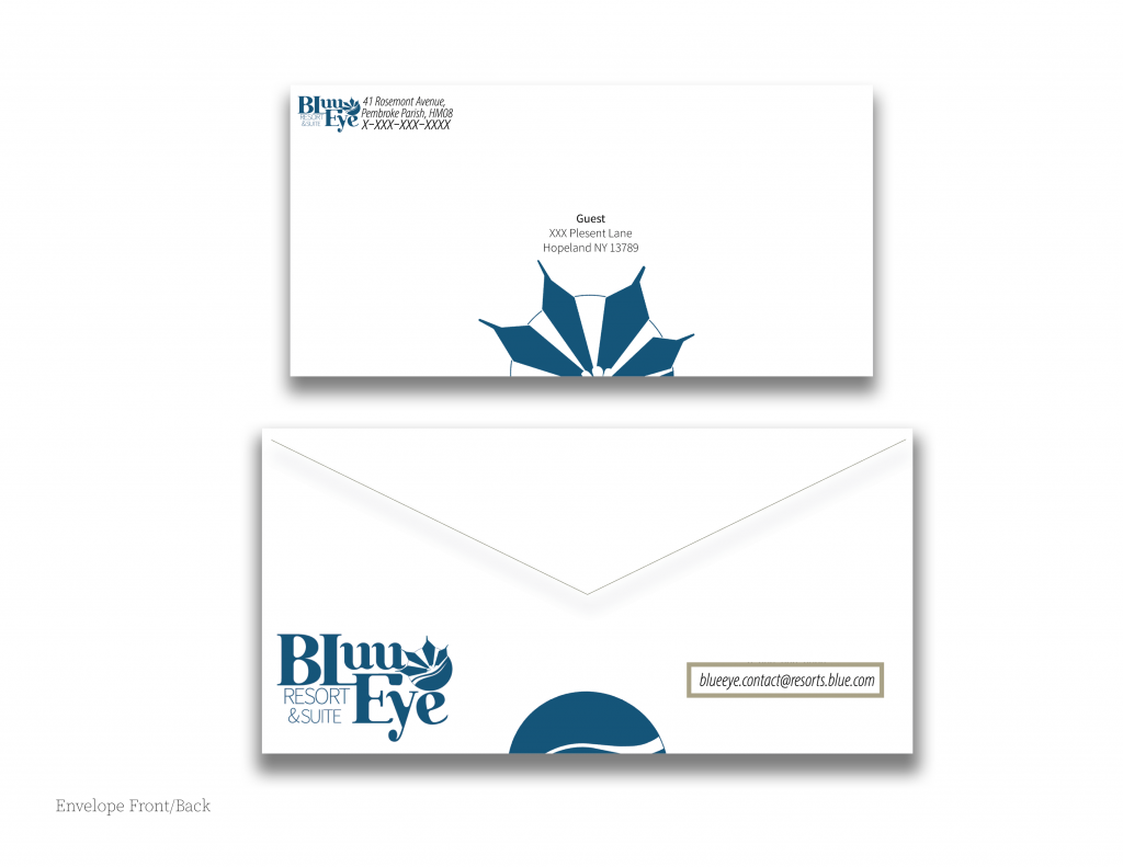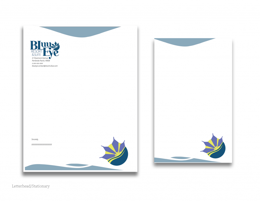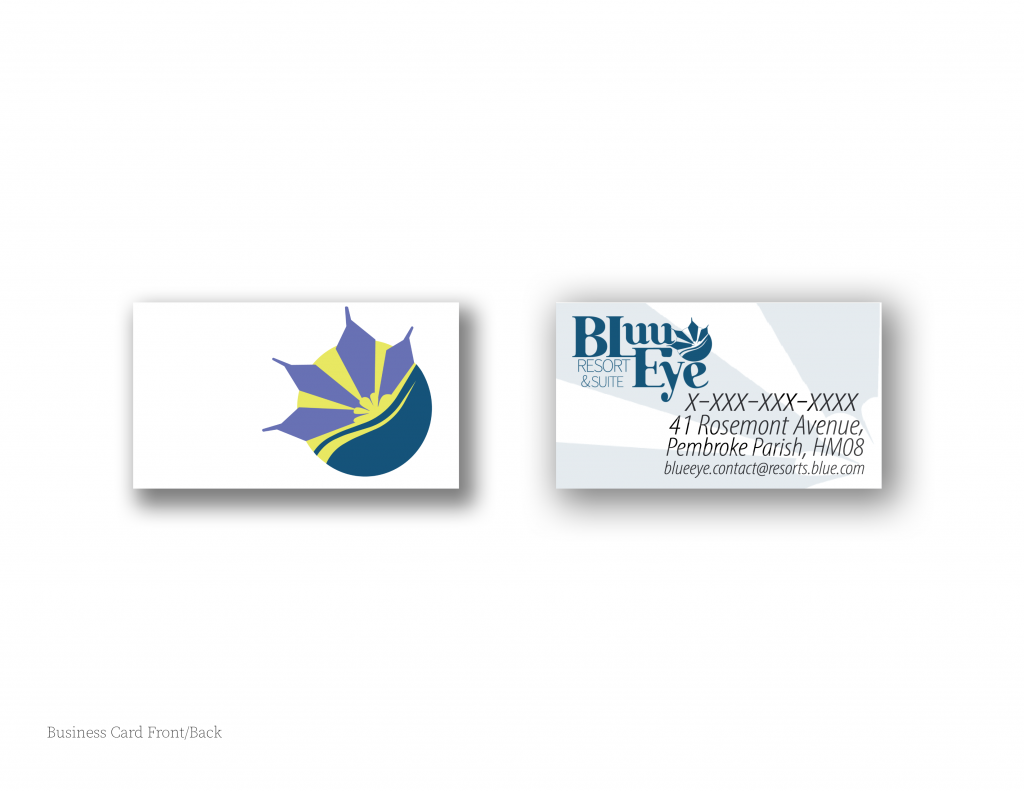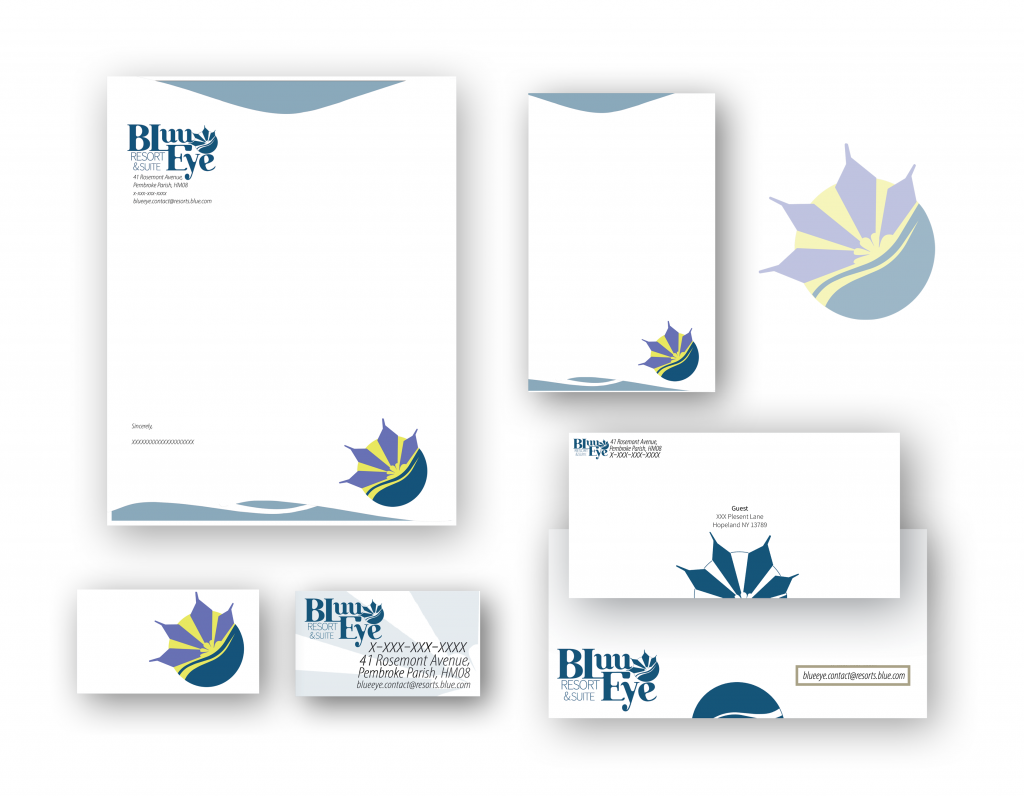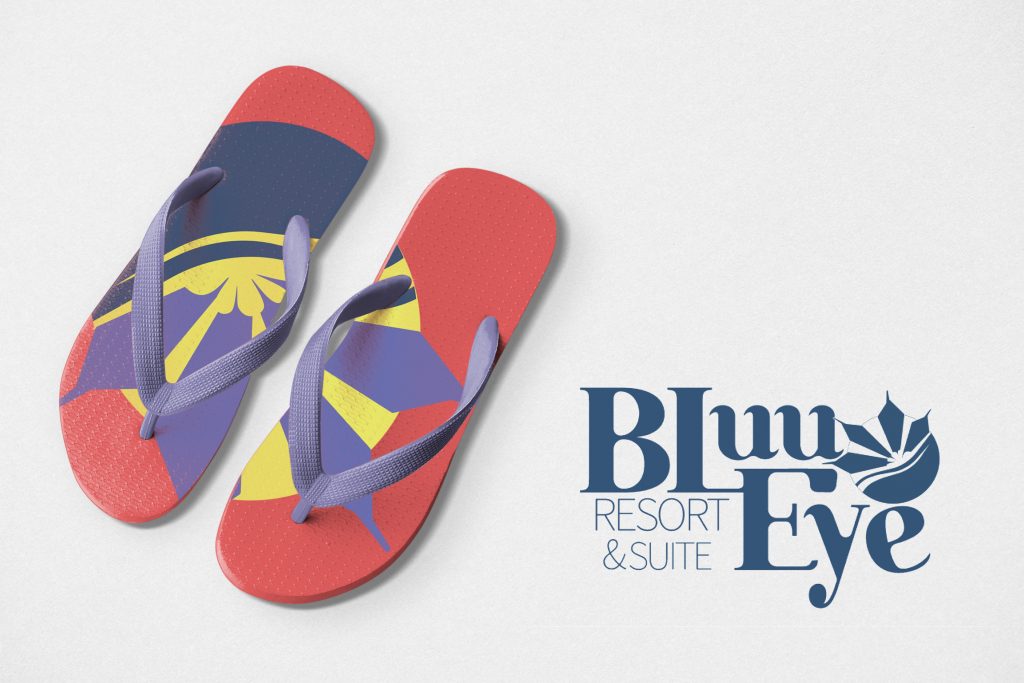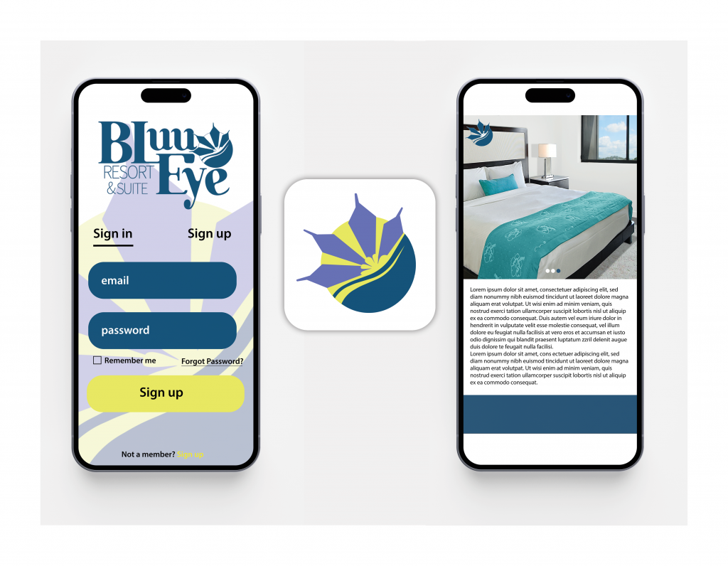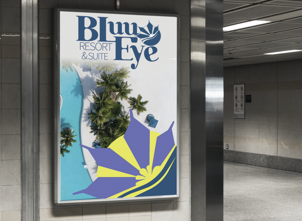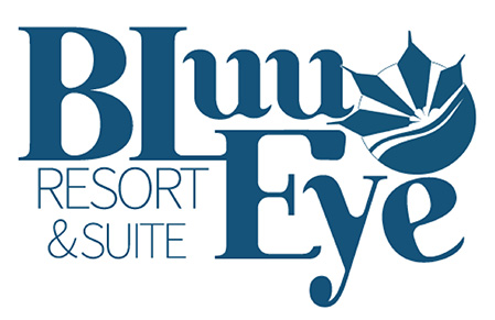
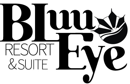
The approach for this assignment was to find a hotel or resort that failed to excel in modern branding standards. I had chosen a small resort on the coast of Bermuda. The original name of the resort was The Rosemont. The logo for the Rosemont was a pineapple incorporated with different scripts. I felt it appropriate to change the name to BluuEye Resort and Suite after the islands native blue-eye grass. I had incorporated its periwinkle like hue into petal like shapes on the logo. These shapes overlapped a yellow sun representing the sunny atmosphere that one could expect from their stay at the resort. A blue wave to represent the blue waters and recreational sports that’s guests can participate in during their stay. I created the logo-type with the intent of the top strokes of certain letters to peak into waves to give the resort title a very aquatic feel.